Page 39 of 64

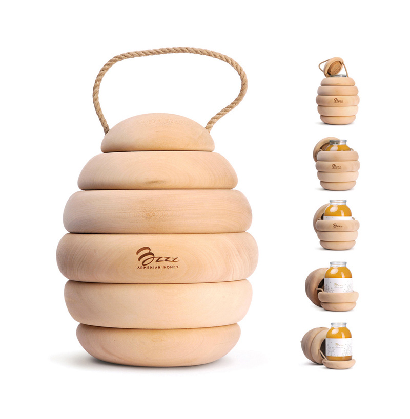
Bzzz Honey

bzzz honey packaging, Backbone Studio

This smart honey packaging was designed by Backbone Studio, a super branding studio from Armenia, that I was very happy to discover.

“The most tasty honey is in the beehive. But it is impossible to buy it in a market –  it was impossible. Designers of Backbone Studio have made it out of wood and hid the can with honey into the improvised beehive.  The simple but simultaneously original wooden wrapper is the message to the nature, ecology and pure taste. You immediately want to open and taste it. And there are no bees!”
It’s Friday!


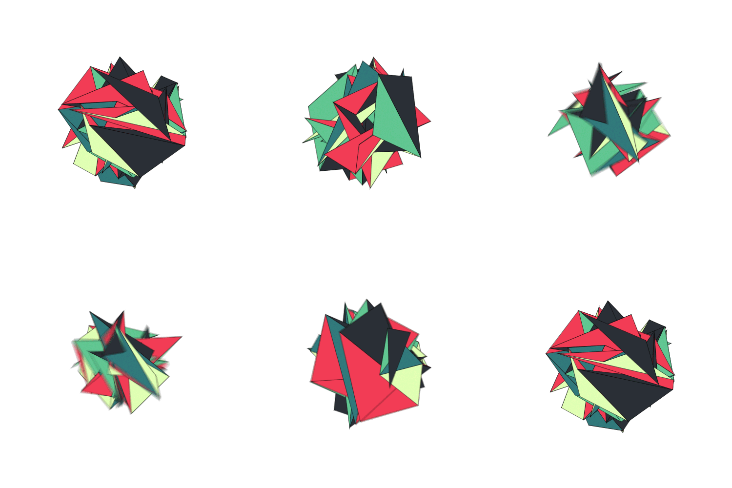
tumblr_ng83mrxBuO1qc0s10o1_500

Gif animation design by Patakk.

A few links:

Have a super weekend!

Paper sculptures

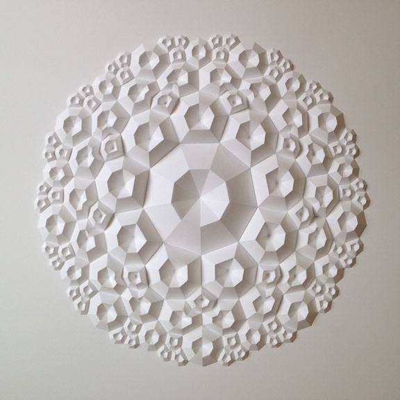
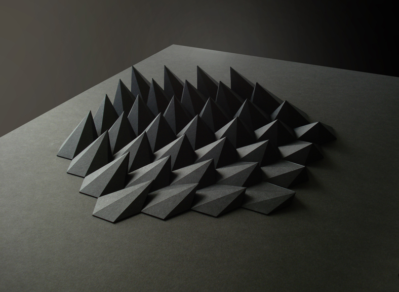
Matthew Shlian enneagon Paper sculptures

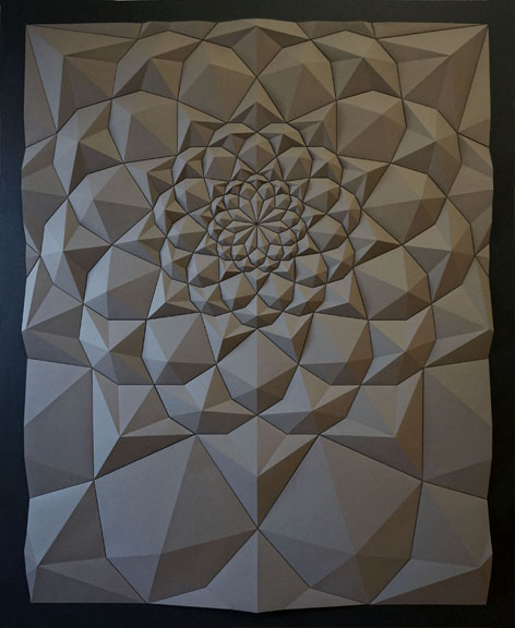
Matthew Shlian Ara165 Paper sculptures

sphex Matt Salian Paper sculptures

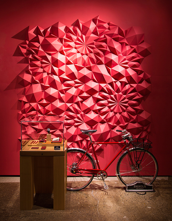
shinola Matt Salian Paper sculptures

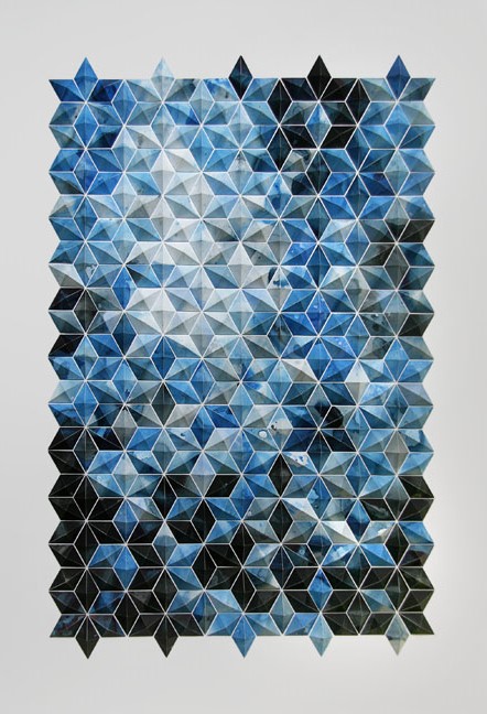
matthew shlian breath castles blue

This is Matt Shlian, a paper engineer and artist who makes extraordinary things with paper. His work is often monochromatic, just letting the light and the shadow play with the shapes. These are just a few pieces from his work. Beautiful.

Pixar in A Box – free animation courses

Pixar in a Box from Khan Academy

As a member of a Pixar-crazed family, it is very interesting that Pixar Animation Studios has teamed up with Khan Academy to release Pixar in A Box, a new free online resource, where through a series of great video lessons, interactive exercises and hands-on activities, students discover how the math concepts they learn in school enable Pixar filmmakers to work on things like Environmental Modeling, Character Modeling, Animation, Crowds, Sets and Staging, and Rendering. The program is designed for kids in sixth grade and up, but is available and accessible to all ages. Each part has a series of short videos explaining the practical use of math using an example from a Pixar movie, then the user can play around with an app online.

Great for kids to see the connection between the math they learn at school and their application in the cool world of Pixar.

(via)

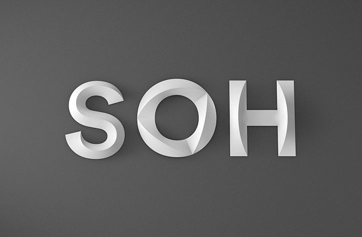
Rebranding of the Sydney Opera House

SOH new identity Utzon Interbrand Australia Stand Apart

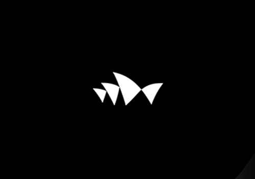
SOH new logo Interbrand Australia Stand Apart

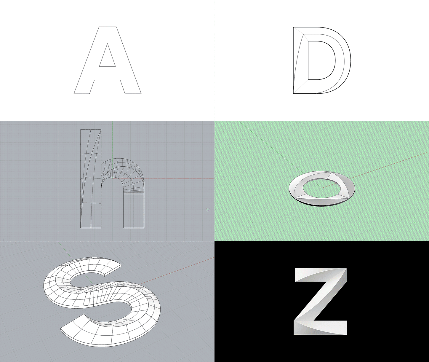
SOH new identity Interbrand Australia Stand Apart

The Sydney Opera House has a super sleek and minimal new identity. Australian agency Interbrand Australia created a complete visual language including a new logo mimicking the shape of the building’s sails and a beautiful 3D typeface called Utzon (named after SOH’s visionary architect Jørn Utzon) which was designed with Studio Laurenz Brunner and reflects the contours of the iconic building itself.

(via)

« Older posts Newer posts »

© 2026 Setaprint

Theme by Anders Noren — Up ↑